PRODUCT CASE STUDY

TinyTales

TinyTales

TinyTales

From a sprint exercise to a polished reading product for children and parents.

From a sprint exercise to a polished reading product for children and parents.

From a sprint exercise to a polished reading product for children and parents.

Role UX design, research, product direction

Duration 12 weeks

Platform iOS mobile app
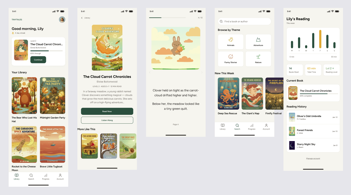
Final TinyTales app screens

INTERFACE DETAILS

Crops from the uploaded product screens show how the system moved from book discovery into focused reading and browsing.

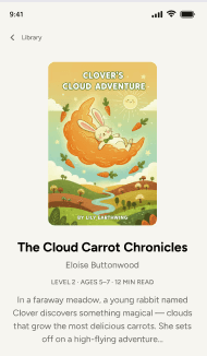
Cropped TinyTales library and book cover interface
Cropped TinyTales reading view interface
Cropped TinyTales browse and discovery interface

THE PROJECT

TinyTales helps children ages 5–12 discover books they’ll love. The challenge was to balance a playful, age-appropriate world with the clarity parents expect from a real product.

TinyTales helps children ages 5–12 discover books they’ll love. The challenge was to balance a playful, age-appropriate world with the clarity parents expect from a real product.

TinyTales helps children ages 5–12 discover books they’ll love. The challenge was to balance a playful, age-appropriate world with the clarity parents expect from a real product.

DESIGN THESIS

A children’s reading app has two audiences: the child looking for delight, and the adult looking for confidence. The final product needed to serve both without feeling split in two.

A children’s reading app has two audiences: the child looking for delight, and the adult looking for confidence. The final product needed to serve both without feeling split in two.

TinyTales book artwork

DESIGN PROCESS

A product language, not a school presentation.

A product language, not a school presentation.

A product language, not a school presentation.

The work moved through three rounds: proving the flow, testing how much personality the interface could carry, and landing on a calmer reading product.

The work moved through three rounds: proving the flow, testing how much personality the interface could carry, and landing on a calmer reading product.

The work moved through three rounds: proving the flow, testing how much personality the interface could carry, and landing on a calmer reading product.

PHASE 01

Establishing the spine

Functional flows, simple screens, and enough structure to understand what parents and children needed from the product.

PHASE 02

Adding personality, then editing it back

Color, icons, and gamified cues helped the product feel alive — then testing showed where delight became friction.

PHASE 03

Finding the quiet version

The final direction uses warm illustration, soft neutrals, and clear hierarchy so the books — not the interface — carry the energy.

TinyTales process and early screens

STRATEGY

Three decisions shaped the product.

Three decisions shaped the product.

Three decisions shaped the product.

Dual audience design

Kids consume the stories. Parents manage settings, subscriptions, and trust. The navigation had to make both roles feel considered.

Search beyond keywords

Discovery moved toward reading level, estimated story time, and theme — the criteria families actually use when choosing a book.

Quiet during reading

The reading view strips the interface back, keeping progress visible while letting the story and illustration hold attention.

BEFORE

Visual noise

Visual noise

Early screens leaned on bold color, icons, and gamified controls. The energy was useful, but it competed with the reading task.
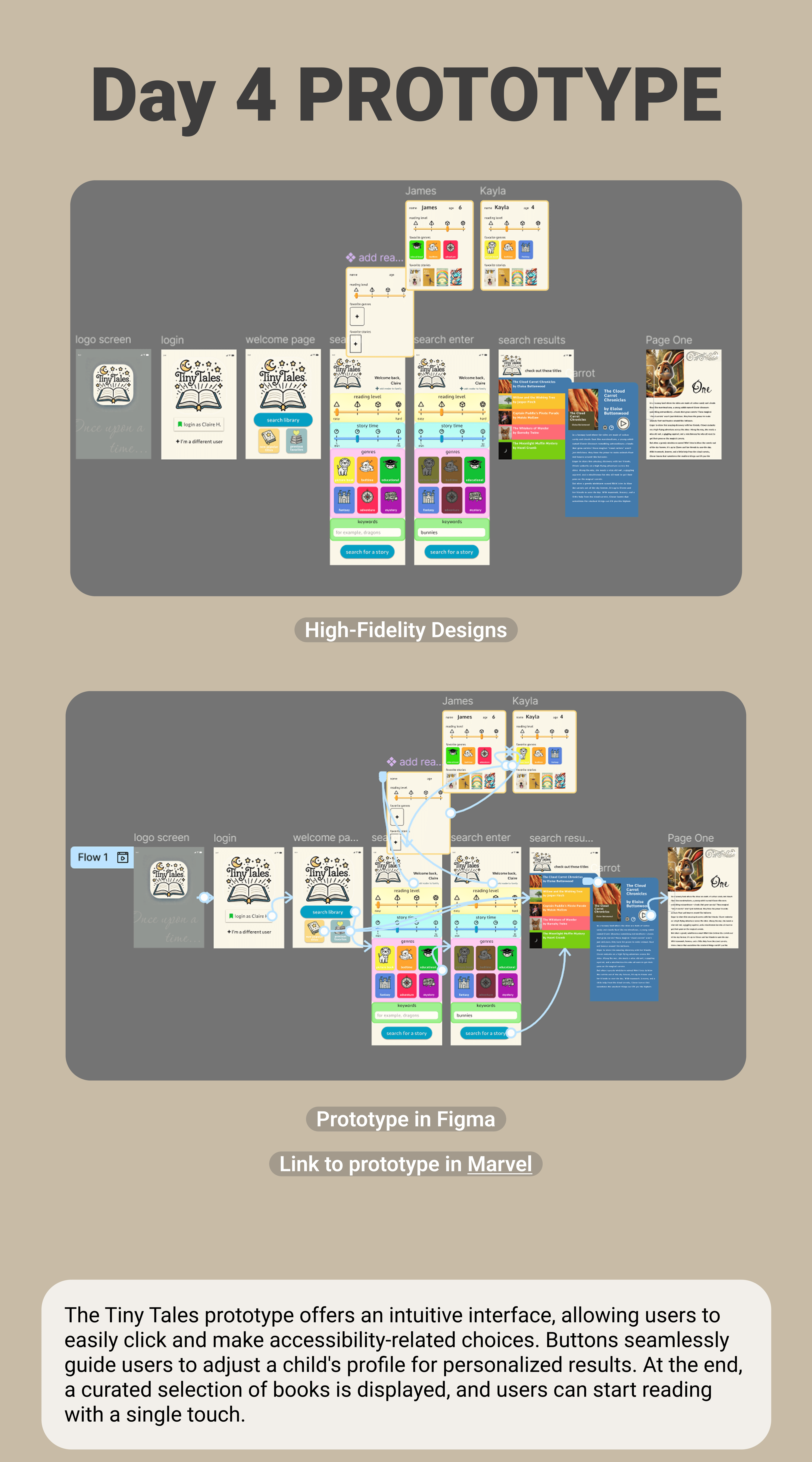
Early TinyTales prototype detail

AFTER

Clarity and focus

Clarity and focus

The final interface keeps the warmth in the books and illustrations, while the system itself becomes calmer, easier to scan, and more trustworthy.

Final TinyTales interface detail

THE SOLUTION

Final design highlights

Final design highlights

Final design highlights

01

Personalized home

A welcoming dashboard tracks progress and surfaces the next book in a series, reducing choice paralysis.

02

Smart discovery

Themed browsing lets children choose by interest — animals, adventure, funny stories, nature — rather than relying on keywords alone.

03

Immersive reading

A full-screen reading view borrows the simplicity of a physical book while keeping progress cues close but quiet.

04

Progress tracking

Reading streaks and milestones celebrate progress without turning the product into a slot machine.

“Designing for children requires the same rigor as designing for experts — just a different set of constraints.”

“Designing for children requires the same rigor as designing for experts — just a different set of constraints.”

“Designing for children requires the same rigor as designing for experts — just a different set of constraints.”

Simplification is hard. The biggest breakthrough came when 40% of the initial “fun” decoration was removed and the reading itself became the focus.

Trust the quiet. Children stayed engaged longer when the UI gave the illustrations room to do the expressive work.

Bring me something thorny, useful, strange, or worth making kinder.

Bring me something thorny, useful, strange, or worth making kinder.

For product direction, accessibility work, workshops, illustration, and writing projects.

For product direction, accessibility work, workshops, illustration, and writing projects.